
covermaker, covermaker, make me a cover
/It's hard to believe it's been nearly three weeks since IT FALLS APART made its debut in the e-book/paperback world. Thank you so much to everyone who has purchased, read, reviewed, recommended, or gifted my book. Your support means so much to me.
Today, I have another fun little look at what went into publishing IT FALLS APART, specifically with regards to the cover art. I don't know about you, but I love a good book cover, and I'm also a big fan of deleted scenes, alternate endings, and seeing things that almost were. Some people will tell you that once you land on a cover image, you shouldn't bother sharing what might have been for fear that people might like that version better, but I think people are going to have different tastes no matter what you do, so you might as well have some fun along the way, and I found the process of designing cover options for the novel to be a lot of fun.
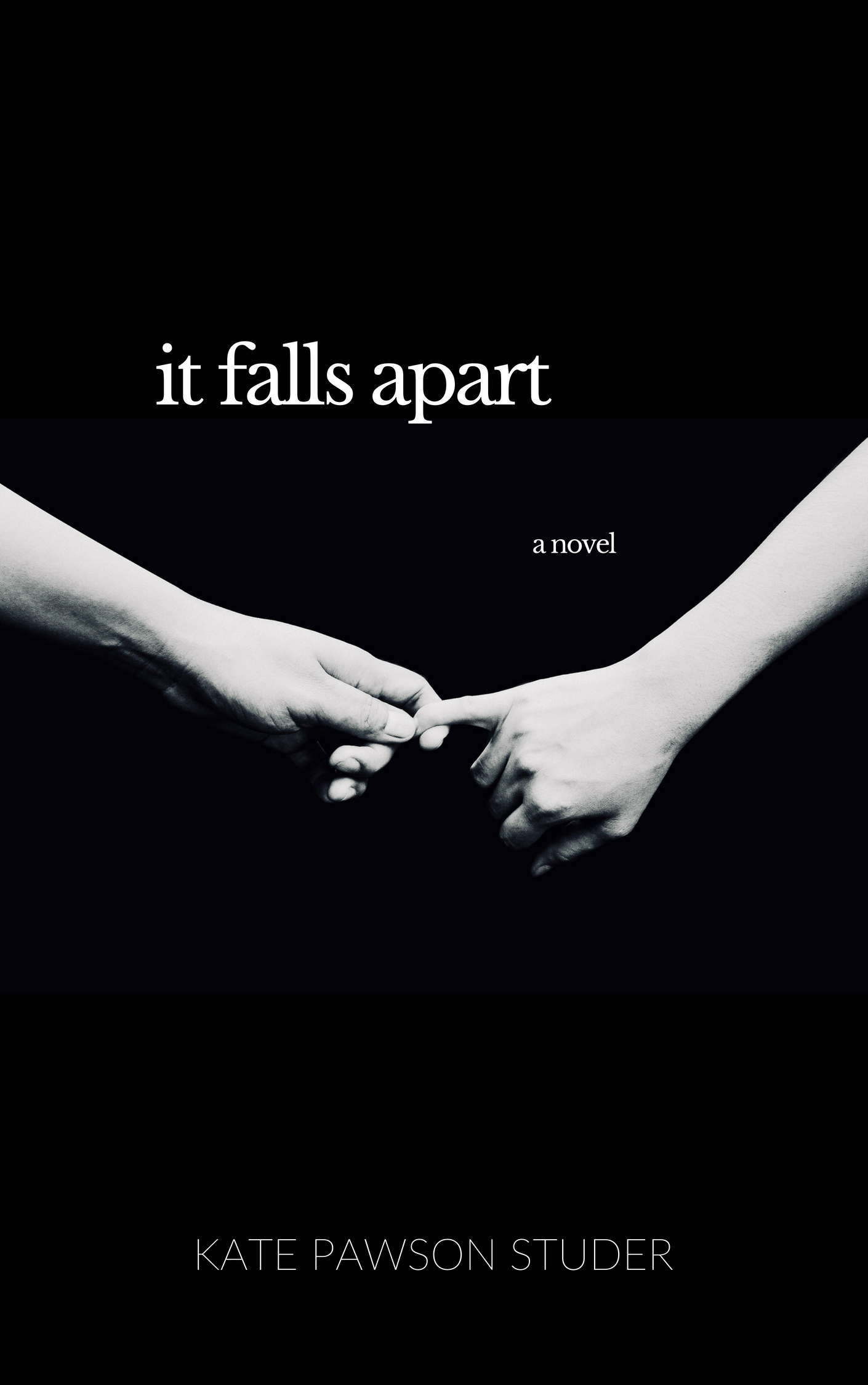
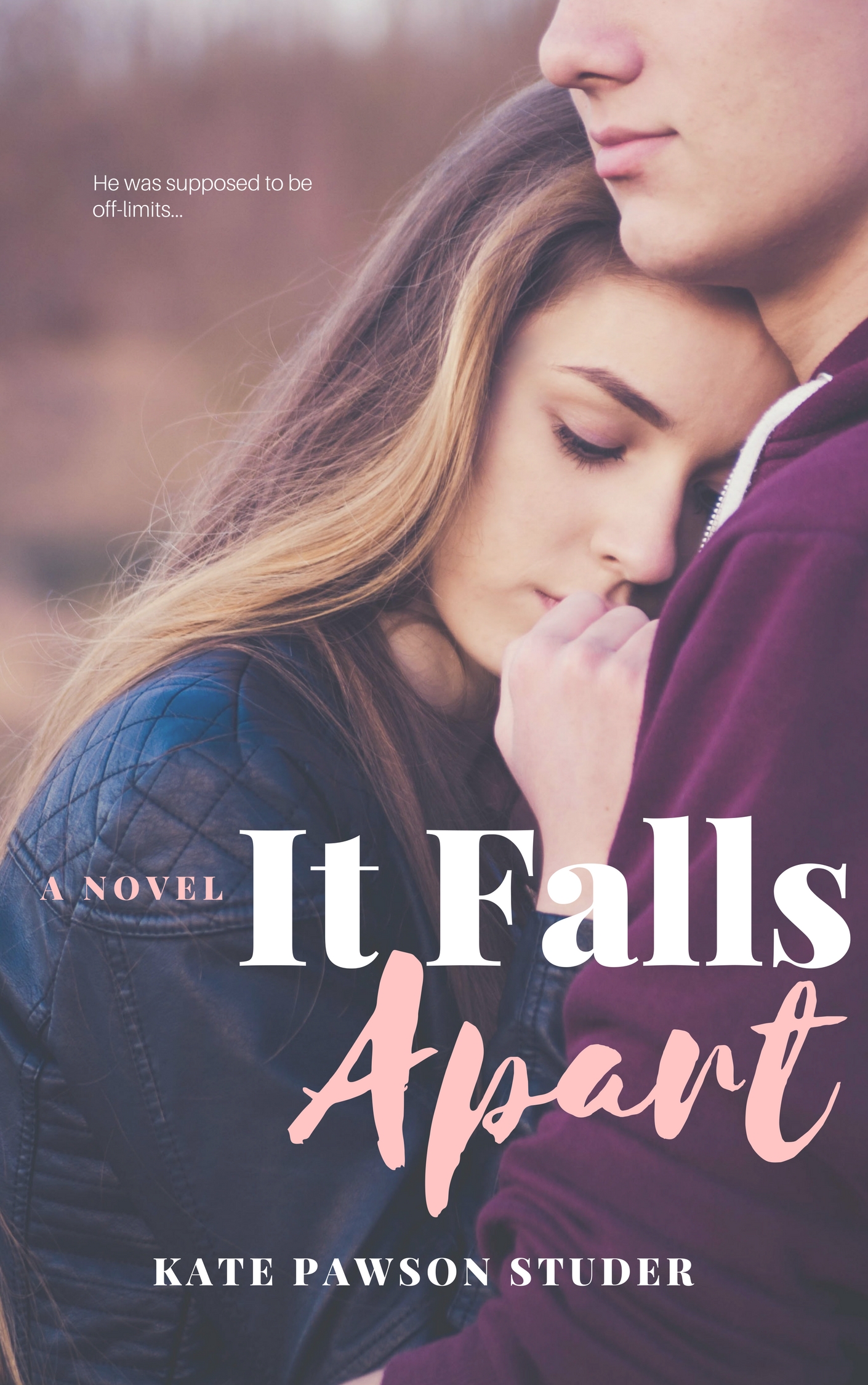
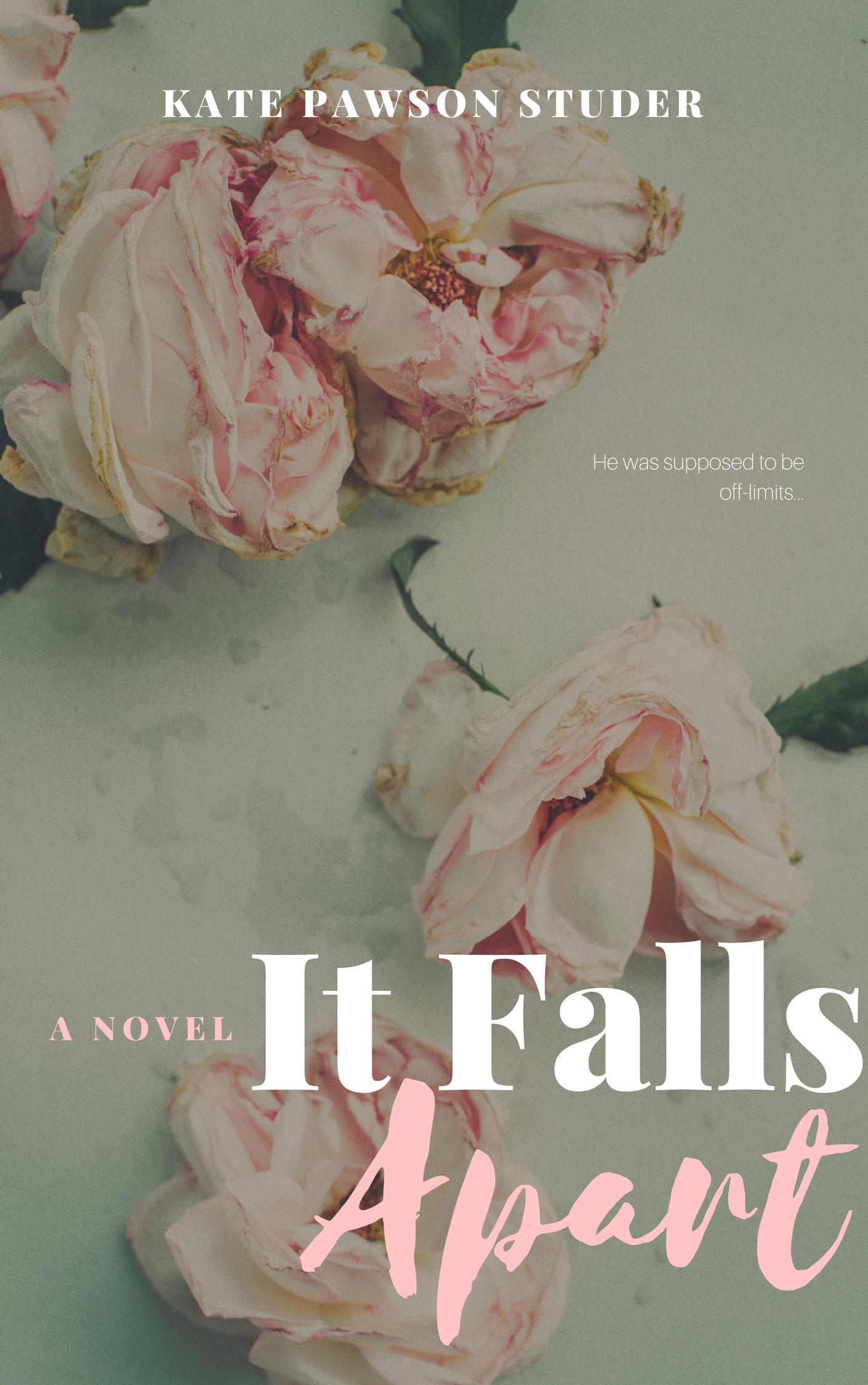
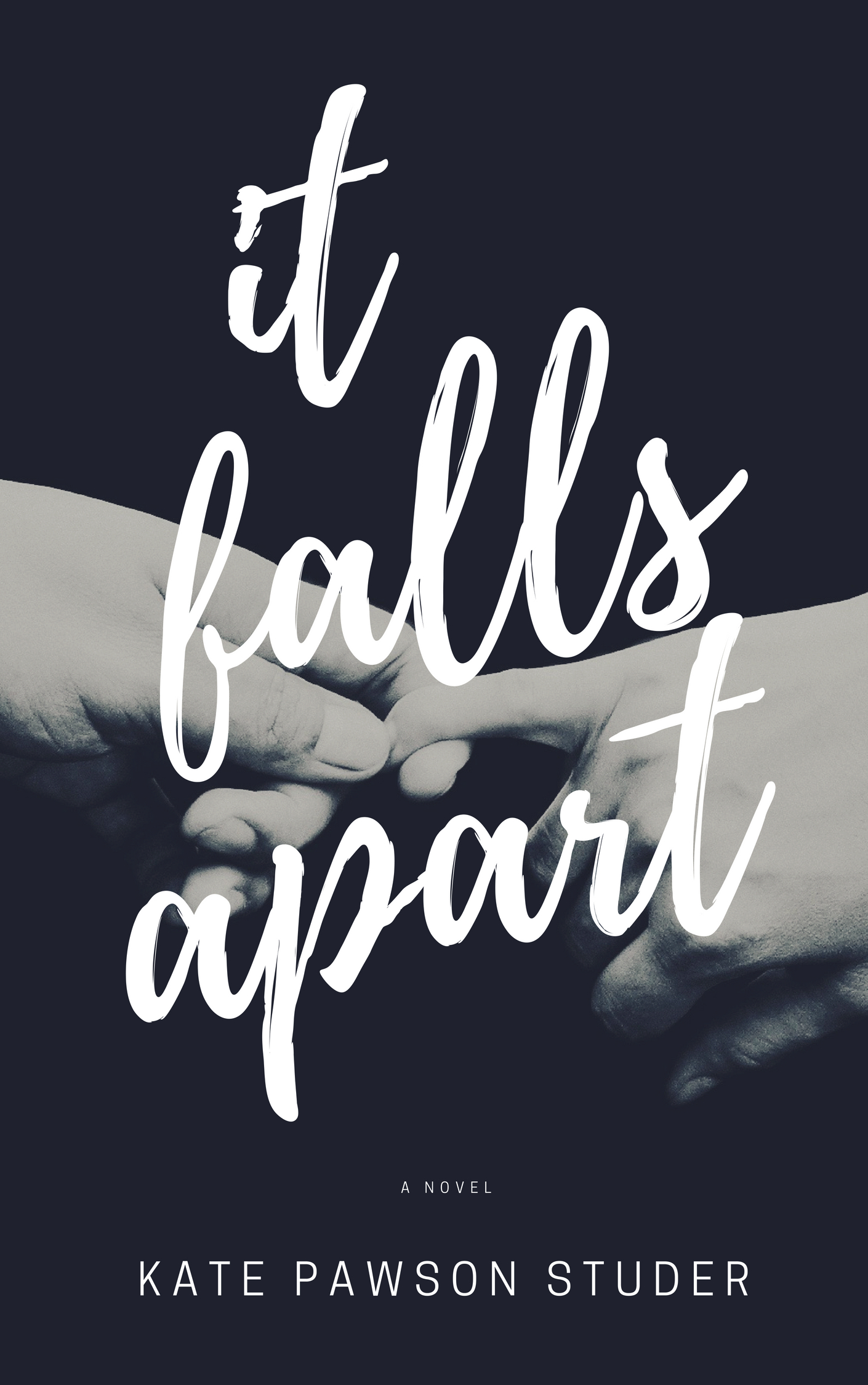
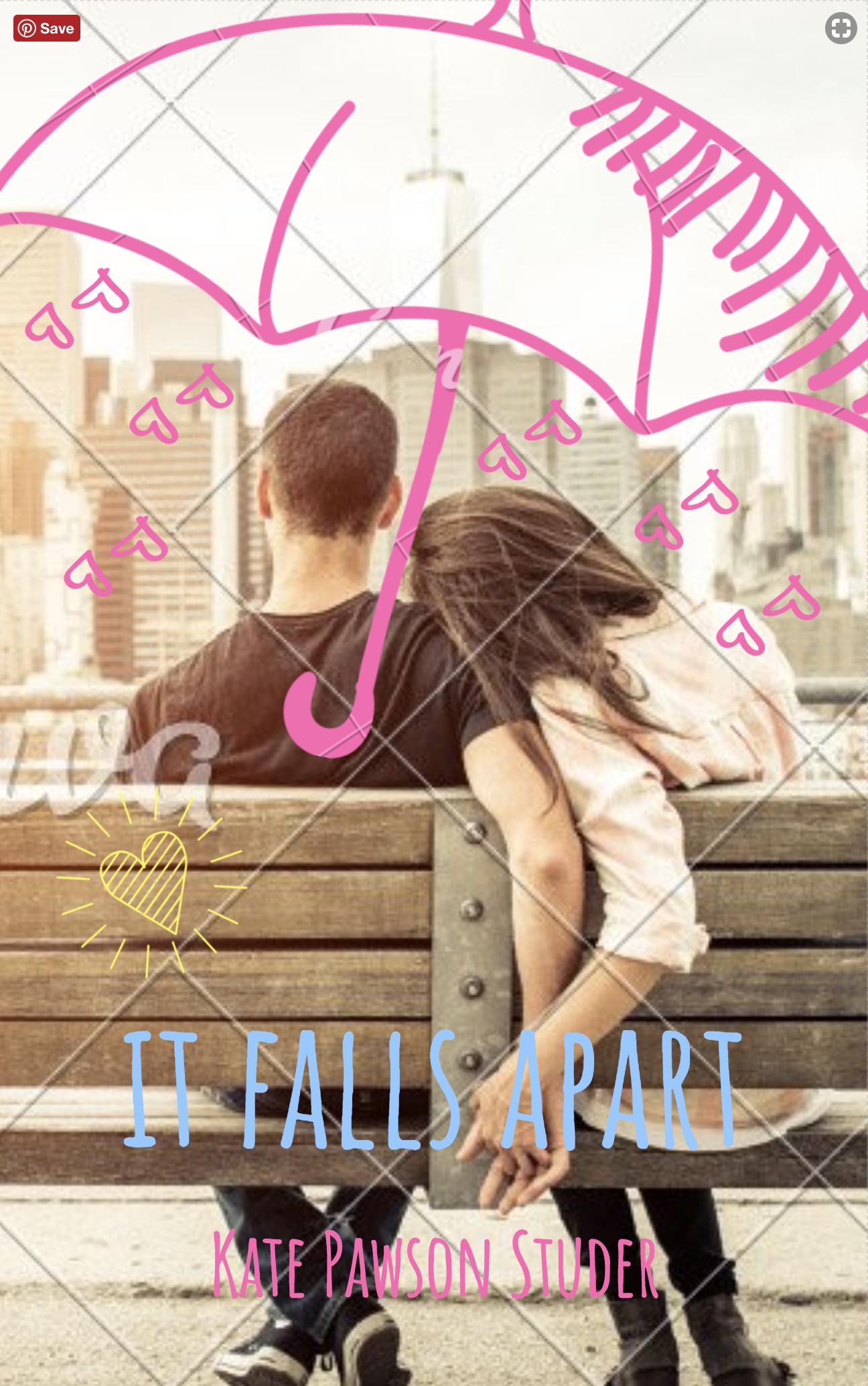
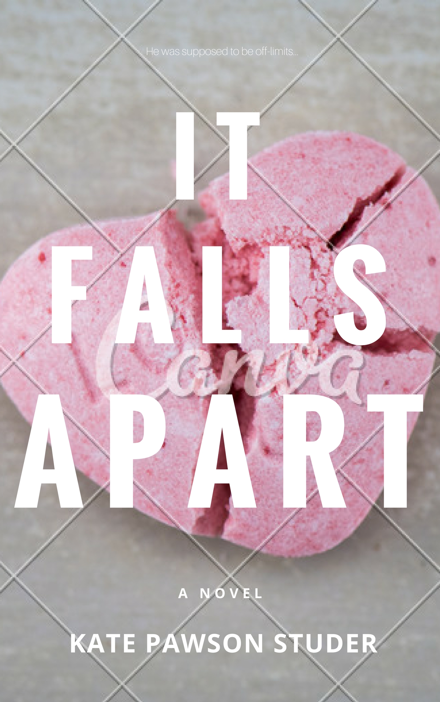
When I set out to find a cover image for the Radish pre-release, I wanted something that would stand out without text (Radish doesn't allow covers with text), so I went with the heavily iconic image of two hands barely hanging on because to me, that was really representative of not only Harper and Luke's story (wanting to be together despite the forces keeping them apart) as well as Harper and Chloe's story (two best friends trying to hang on to their friendship despite some major obstacles). It was fitting, and I still like the drama of that image, but when it came time to create the cover for the e-book, I knew I wanted something new, something fresh, and something that very clearly said, "THIS IS A FUN, SEXY, FLIRTY YA ROMANCE". I think I accomplished that with the final cover (which you can see below), but as I said above, I did have some fun along the way; click through the below gallery to see some of the cover options I explored (some are watermarked as these are only mock-ups) on my journey to that final cover, including titled versions of both covers that made it to Radish:
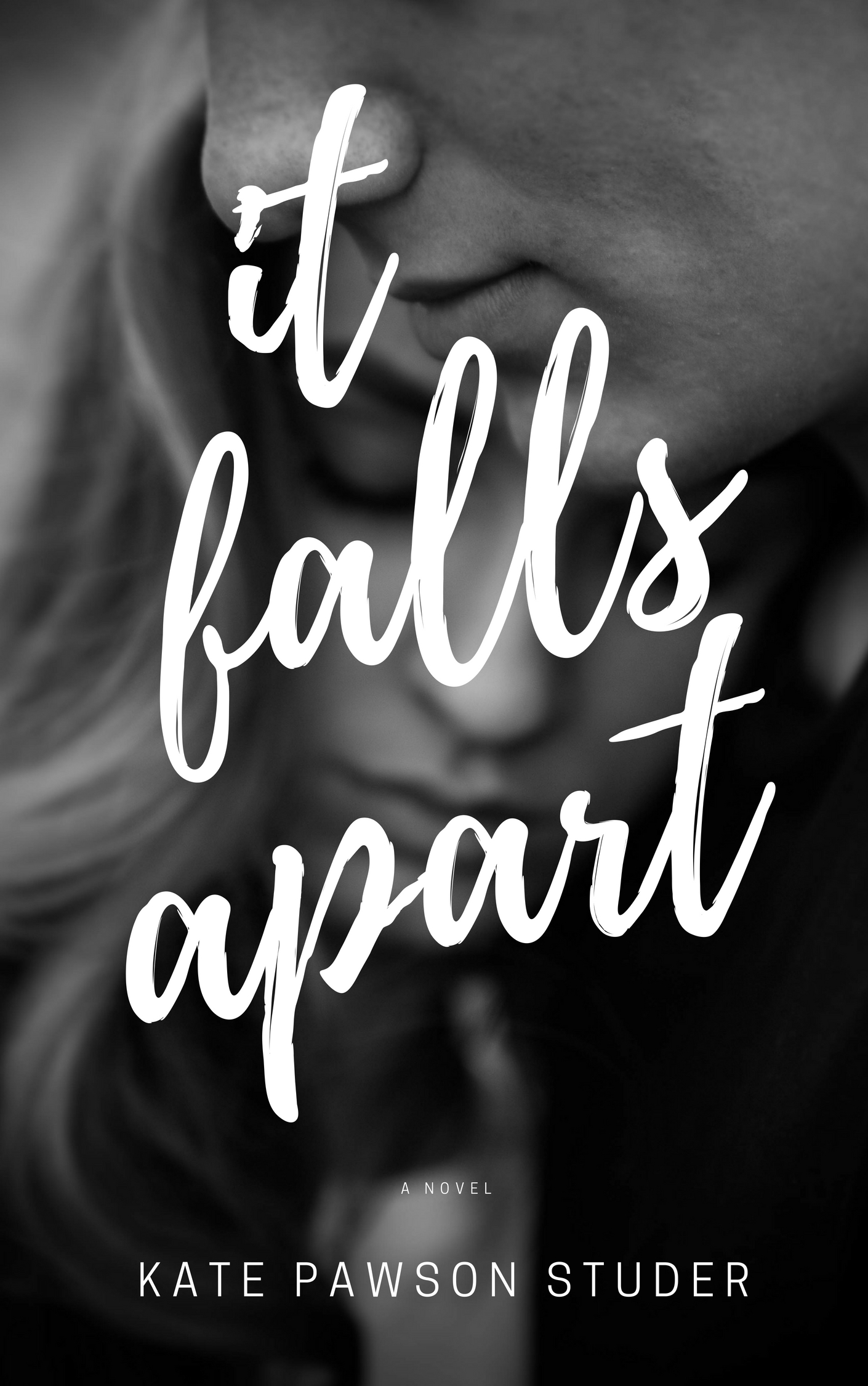
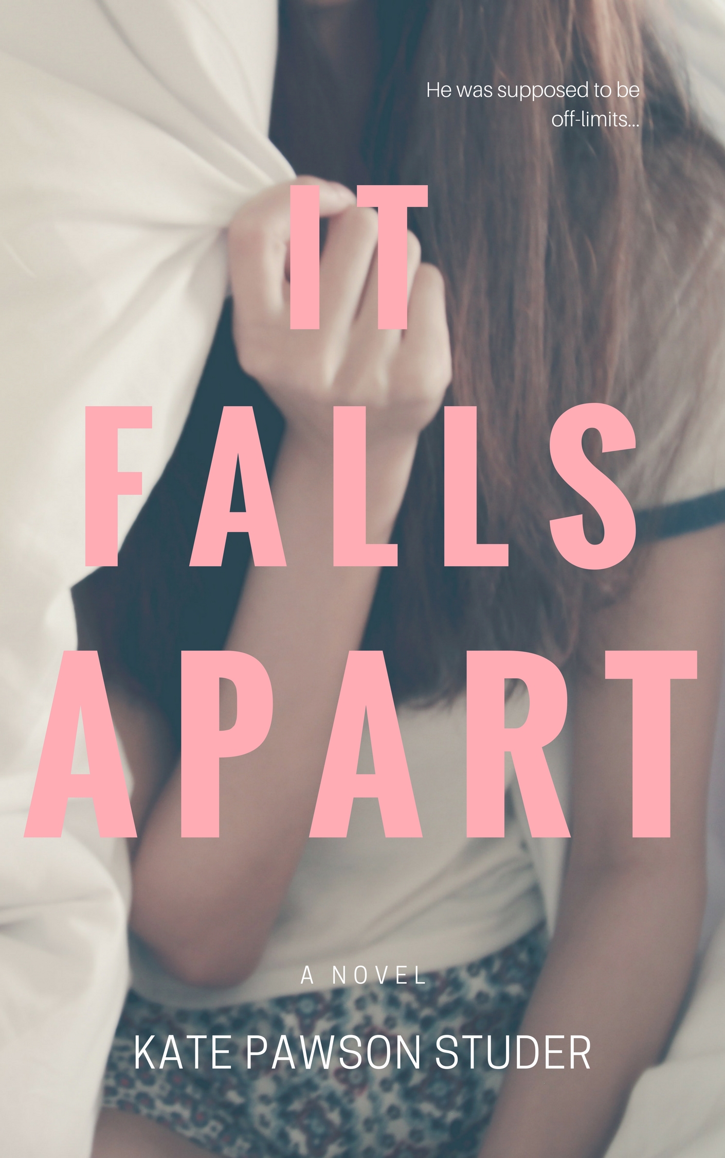
When all was said and done, the photograph I chose to use was one by Thai photographer, Tirachard Kumtanom, whose work is fun, fresh, and just lovely. Here is the full image I used for the final cover of IT FALLS APART. I love the flirty, youthful vibe conveyed by the white bedsheets, sunlit background, and playful pose of the model. To me, it perfectly captures the way Luke makes Harper feel--carefree and in love despite the world falling apart around her.

And here, of course, is the final cover: